What is UX design and how does it affect sales?

CEO 234.studio •
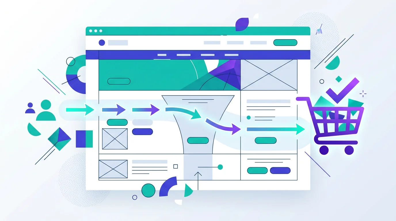
Your website looks polished, yet customers leave before calling or finishing checkout. The visual design may be fine. Watch what happens when someone tries to use it, though. A buried button or awkward form can interrupt the journey.
Look for ordinary trouble: a buried button, a slow product page or a form that asks for too much. Once you can reproduce the problem, change one part and measure what happened.
What does UX design mean?
UX stands for User Experience. It covers how people move through a website, application or online store and whether they can complete the task they came for. Appearance matters, but it cannot rescue a broken checkout.
Picture a retail store where products follow a logical order and the checkout counter is easy to see. Now hide that counter behind an unmarked door and require three forms before payment. The stock has not changed, but buying it has become a chore. Websites lose customers in the same mundane ways.
Online, leaving takes one tap. A customer who gets stuck can return to the search results and try another company.
How does UX affect sales?
UX affects whether a visitor reaches the action the business needs. Each obstacle wastes some of the attention that paid and organic traffic brought to the page.
Removing obstacles between the customer and the purchase can improve results without increasing advertising spend. The same visitors simply encounter fewer reasons to leave.
A customer frustrated by search or a form may leave. That makes paid traffic harder to justify because the website loses people after the ad has already done its job.
A 12-field form asks for a commitment before the conversation has started. Keep the few details the team genuinely needs, then collect the rest during the call.
UI, or User Interface, covers appearance such as colors, typefaces and buttons. UX covers behavior. Can visitors find the right page? Do they understand the next step? A beautiful website can still be miserable to use, while a plain one may let customers complete a purchase with little confusion. A good project pays attention to both.
7 signs that your website has a UX problem
You can spot many of these problems without UX training. One serious issue on a checkout or inquiry form can be enough to investigate:
-
Visitors leave from an important page. Slow loading, unreadable content and an unclear offer are common causes. Compare pages with similar intent before blaming one number.
-
Few inquiries despite steady traffic. Analytics show that people reach the service page, but the inquiry total stays flat. Check whether the next step is visible and specific.
-
Customers ask about information already on the site. Calls about a published price show that the answer is hard to find. Check the page hierarchy and the words used in the menu.
-
The mobile site feels like a shrunken desktop page. Tiny copy and crowded controls make an ordinary phone task unnecessarily hard, especially when the form still uses its desktop layout.
-
Nobody clicks the main call to action. The "Request a quote" button may be too small, buried too far down the page or vague about what happens after the click.
-
Shoppers abandon the cart. Too many steps, forced registration or delivery costs revealed at the end can stop a purchase that was nearly complete.
-
The website feels slow or shifts while loading. Speed is part of UX. Google's Core Web Vitals guidance explains how to measure the delays and layout movement people actually notice.
Ask someone unfamiliar with the site to find a service, check a price or send an inquiry. Note where they pause, backtrack or ask for help. Those moments give you a better starting point than a general opinion about the design.
What does good UX look like in practice?
The details vary by project. These checks keep the basic journey usable:
Good UX
Important information easy to find / A short route to the main task / Clear call-to-action buttons / Forms that ask only for needed details / A mobile layout tested on a real phone
Poor UX
A wall of copy with no hierarchy / Contact details hidden away / Pop-ups blocking the content / A long form that asks for secondary details / Confusing mobile navigation
Good UX leaves room for character and rich visual design. Decoration has to earn its place when it sits in the way of a task. Shorten the purchase where the data supports it. For a phone-led service, make the number easy to find on a small screen.
Where should you start improving website UX?
A full redesign can wait. Start with a task you can reproduce and make one change at a time:
Shorten the contact form
Keep only the details needed to respond well. Collect secondary information during the first conversation unless it is essential for routing the inquiry.
Place calls to action where people need them
A service page should make the contact route easy to find. The right spot depends on the page, so test the button or phone number in context instead of repeating it by rule.
Check website speed
Compress photographs, remove unused scripts and enable caching where appropriate. Use Core Web Vitals as diagnostic data, then test the main journey on an ordinary phone.
Remove the friction you can see
UX design supports the commercial job of a website. An obstacle on a busy inquiry page deserves attention because the company may be paying to send people there.
Start with an awkward task you can reproduce. Change the part where people get stuck, then compare the same business outcome before and after the change. If the problems run through the whole site, our guide to building a website from scratch explains the larger process. WordPress users can also read our comparison with custom development, then make sure the landing experience deserves the traffic before planning Facebook advertising.
Rafał Krzysztofiak
CEO and founder of 234.studio. He has spent over 10 years designing and building websites and web applications for sole proprietors, growing teams and established companies.
More about the author