Online store mistakes: what we would improve on Hrabikon.pl

CEO 234.studio •

On a riding boot page, the navigation overlaps the product name. Switching to a phone removes that overlap, but the footwear category fills its first screen with a header and controls. No boots yet.
We reviewed Hrabikon.pl, a Polish equestrian store selling equipment for horses and riders. It already has detailed categories, product photography and equipment guides. I would keep that specialist structure and start with the places where customers have to interpret a form or scroll through controls before seeing what they can buy.
We inspected the public interface on September 9, 2026, including browser widths of 1280 and 390 px. We had no access to store analytics or administration. Screenshots record that visit. This is an independent review with proposed improvements, not a case study of work delivered for Hrabikon.pl.
Navigation overlaps the product title
At 1280 px wide, navigation on the Kilkenny boot page wraps into two rows. The lower row overlaps the title. A red promotion link runs across the white lettering of the product name, as the screenshot shows.
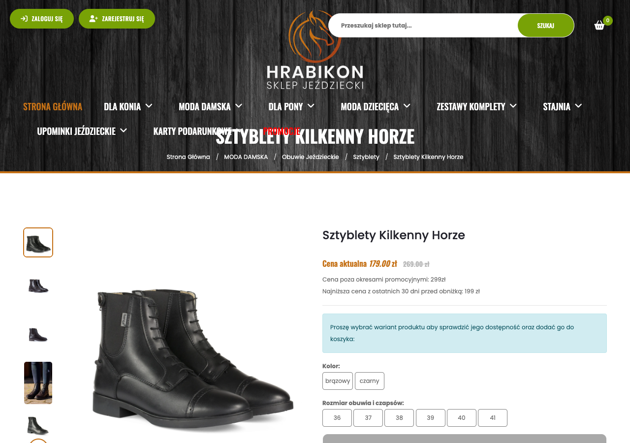
The header needs to accommodate the actual navigation height when links wrap onto a second line, including widths just before the mobile menu takes over. I would also check the sticky header after scrolling and repeat the test with enlarged browser text.
The home page has a 12-slide carousel. Its length alone cannot tell us anything about lost sales. Before commissioning another banner, I would check which slides receive clicks and whether customers see the offers near the end of the sequence. Selected promotions could become static tiles below the main banner, available as customers scroll without waiting for a slide change.
Four prices and an initial quantity of zero
The same boot page displays a current price of PLN 179, a crossed-out PLN 269, PLN 299 labeled as the price outside promotions, and PLN 199 as the lowest price during the 30 days before the reduction. The amount to pay is stated. The two reference prices need explaining: what does PLN 269 represent, and how does it relate to PLN 299? Source: product page.
Clarify those labels. Give the current price visual priority and identify the purpose and source of each reference amount. Whoever maintains the catalog should also check these values against the promotion shown on the product listing. A screenshot cannot establish the price history.
Below the color and size options, the quantity field initially contains 0. A message asks customers to enter a quantity before adding the item to the cart. For an available variant, I would default that field to one item and show a clear next step while a required size is still missing.
Availability needs its own message. Once a size is selected, the interface should state whether that variant can be bought, with a specific explanation when it cannot. Customers should not have to interpret the gray panel around the cart button to work out what is missing.
I would also add an insole measurement chart for this particular boot. We found material and zipper details in the description, but no such chart. The retailer would need measurements from the manufacturer or a consistent measuring method, because an unrelated generic size chart could send customers toward the wrong fit.
Mobile category controls take up the first screen
At 390 × 844 px, the boot category shows its heading, separate navigation and filter sections, then manufacturer and sorting controls. The first product image sits below the viewport, so customers have to scroll before they can compare boots.
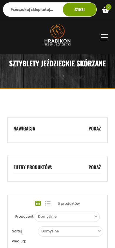
Keep the existing filters. Their opening control and sorting could share a compact bar above the products, with reduced spacing and the result count beside the category name. The separate category tree could sit behind a navigation button. After selecting size 38, customers should see an active filter they can remove with one click.
The catalog also needs a naming check. This category heading describes leather riding boots, while the Kilkenny description specifies synthetic material. Wellington boots appear in the listing too. Review the category alongside the product description before finalizing a new layout.
I would choose a category name that matches its contents and add material as a product attribute and filter. The Wellington boots could move to another group, or the category could deliberately cover several types of footwear. Decide that with the person responsible for the range.
Give the empty cart its own view
The empty cart retains the English column headings REMOVE, IMAGE, PRODUCT and TOTAL inside an otherwise Polish interface. Below them sit a coupon form, an update button and totals of zero. A checkout button is also displayed with no products in the cart.
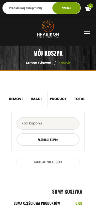
Use a dedicated empty state. A short explanation and a return-to-shopping button would give customers a next step, while the discount form and totals could appear after an item is added. Translate the table headings as well. This part of the review covers an empty cart, without placing an order or making a payment.
Shipping information needs attention earlier in the purchase. The delivery page distinguishes stock dispatched within two working days after payment from products whose fulfillment may take up to two weeks. That difference matters when someone is buying boots for an approaching competition.
Put the estimate beside the variant. The product page could also show the cost of an available delivery method and link to the full terms, so customers can check the conditions without leaving the boots behind. Use actual stock and shipping rules to produce that message, because a blanket 48-hour promise would misrepresent the distinction described on the delivery page.
How we would order the modernization work
I would start with the overlapping menu, price labels and product form states. Each task needs a specific acceptance scenario. For example, at 1280 px, every navigation item and the full boot name should remain readable both before and after scrolling.
Next, reduce the mobile category controls and build the empty cart view. Meanwhile, the person managing the range can collect size measurements, correct material attributes and establish dispatch estimates for variants. A designer cannot recover those details from a boot photograph.
Performance needs a separate measurement. We did not measure Core Web Vitals in this review and have no speed score to assign to the store. Before replacing images or scripts, gather mobile measurements and identify what delays the product display or response to a size selection. Search still needs testing. Try specific product names, misspellings and a query that returns no results, then record what the customer can do in each case.
To assess the changes, track movement from category to product, additions to the cart and completed orders, split by phone and desktop. Account for campaigns and seasonality. An increase in orders after a release could also reflect a promotion or a fresh delivery of popular sizes that were previously unavailable.
For budget planning, see what goes into a store quote. Check maintenance costs too. If you want help with store modernization, bring your store address, a few purchases customers struggle with and support requests about sizes, shipping or the cart.
Rafał Krzysztofiak
CEO and founder of 234.studio. He has spent over 10 years designing and building websites and web applications for sole proprietors, growing teams and established companies.
More about the author